Minimalism in Corporate Brand Identity: Why Silence is the New Loud
By Stephen Mahanaim | CEO, Mahanaim Empire
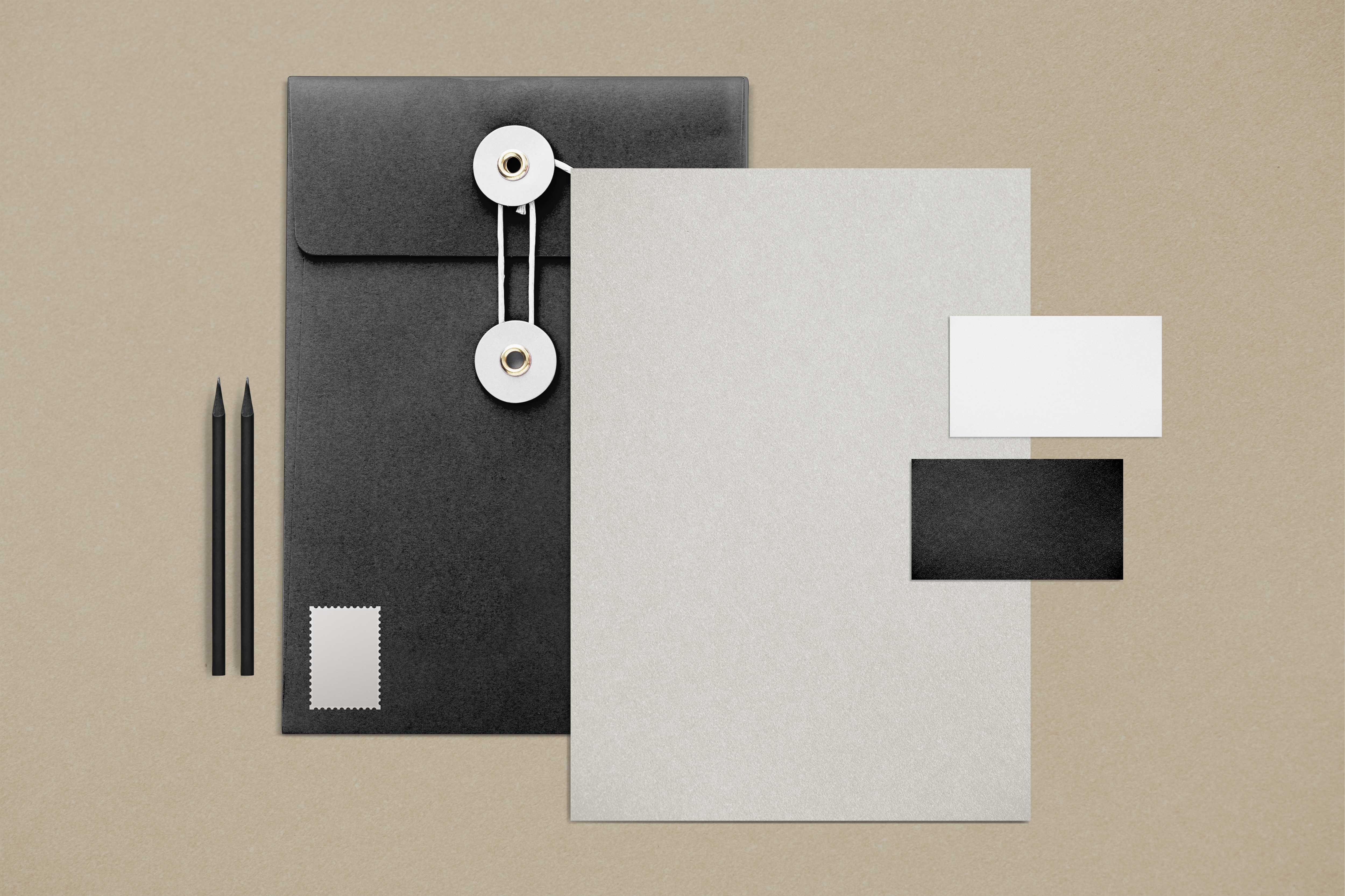
In a digital world screaming for attention, the brands that whisper are the ones getting heard. We are seeing a massive shift in corporate South Africa and the global market: complex, detailed logos are dying. In their place, a new era of Corporate Minimalism has taken over.
At MRC (Mahanaim Resource Centre), when we consult with B2B clients on rebranding, the most common request used to be "make it pop." Now, the request is "make it clean." But minimalism is misunderstood. It is not about cheapening your brand or doing less work. It is about strategic reduction.
Here is a deep dive into why minimalism is the smartest business strategy for your brand identity in the modern economy.
The Business Case for Minimalism: It’s Not Just Art, It’s Economics
Why have giants like Mastercard, Google, and Nissan flattened their logos and stripped away the details? It isn't just a trend; it is a technical necessity born from the digital age.
1. Scalability is King (The "Favicon" Test)
Twenty years ago, a logo only needed to look good on a billboard or a business card. Today, your logo needs to look good on a 16x16 pixel browser tab (favicon), a smartwatch screen, and a mobile app icon. Complex crests and gradients turn into mush at that size. Minimalist designs remain sharp and recognizable whether they are on a massive building wrap in Sandton or a smartphone screen in Soweto.
2. Faster Load Times
From a technical perspective (something our team at SugarCode emphasizes), complex graphics with heavy textures increase file sizes. Minimalist vector assets (SVGs) are lightweight. In an economy where data costs are high and mobile speed is crucial, a cleaner visual identity literally makes your digital platforms faster.
3. COGNITIVE EASE
The human brain prefers simplicity. It takes less mental energy to process a simple geometric shape than a complex illustration. By reducing the noise, you reduce the "cognitive load" on your customer, making your brand easier to remember.
The Fine Line: Minimalism vs. "Blanding"
There is a danger here. In the rush to simplify, many corporates fall into the trap of "Blanding"—where every tech startup and fashion brand starts using the same sans-serif font and black-and-white color scheme. They lose their soul in the process.
True minimalism is not about removing personality; it is about amplifying the essential.
When we approach a brand strategy at Mahanaim, we look for the Irreducible Core. What is the one thing that defines your business? If we take away the shadows, the bevels, and the extra colors, does the brand still stand up? If the answer is yes, you have a timeless identity.
Key Elements of a Minimalist Corporate Identity
If you are considering a refresh or a new go-to-market strategy, look for these three pillars:
- Flat Design: No 3D effects, no shadows, no gradients. This ensures the logo is easily reproducible in print, embroidery, and digital code.
- Restricted Color Palettes: Instead of a rainbow, choose one or two dominant colors. This builds stronger color association (think of the specific red of Coca-Cola or the blue of Facebook).
- Negative Space: Utilizing the empty space around the design to create balance. In design, space is not "empty"—it is an active design element that denotes luxury and confidence.
Is Your Brand Ready to Declutter?
A cluttered brand often reflects a cluttered business strategy. Moving toward minimalism signals maturity. It tells the market: "We know who we are, and we don't need to shout to prove it."
Whether you need to overhaul your visual identity through MRC, or you need to update your digital assets to match the new 4IR standards via SugarCode, the direction is clear: Simplify.
Less isn't just more. In business, less is bold.